15 Colors That Go With Pink in Home Decor
Introduction
Pink can look calm and stylish. Or it can feel too loud and messy. The difference comes down to the colors you pair with it.
Many people like pink but avoid using it at home. They worry it will look too bright, too childish, or hard to match with furniture. That fear often leads to plain spaces with no personality. And that is a missed chance.
The truth is simple. Pink works with many colors if you pick the right tone and balance. Soft blush feels very different from hot pink. Light rooms behave differently than dark ones. When you understand this, things get easier.if you want something attractive so must visit this site Colors That Go With Red Brick
In this guide, you will learn colors that go with pink in home decor and how to use them in real rooms. You will also see how each color changes the mood of your space. By the end, you will have clear ideas you can actually try at home without wasting money.
Why Choosing the Right Colors With Pink Matters
Pink is not just one color. It has warm tones like peach pink and cool tones like dusty rose. If you mix the wrong tones, the room can feel off without you knowing why.
Color also affects how a room feels. Soft pink is known to create a calm mood. Brands like Sherwin Williams explain that lighter pink shades can reduce stress and make a space feel safe. That is why you often see them in bedrooms.Some more ideas Mobile Home Curtain Ideas
Trends also support this. Pantone and Dulux reports show that pink works best when paired with neutral and earthy tones. These pairings make pink feel modern instead of childish.
Lighting plays a big role too. In bright rooms, pink looks softer. In low light, it can look darker or even dull. So the color you choose must work with your space, not just your taste.
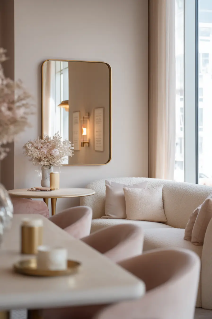
White Keeps Pink Clean and Bright
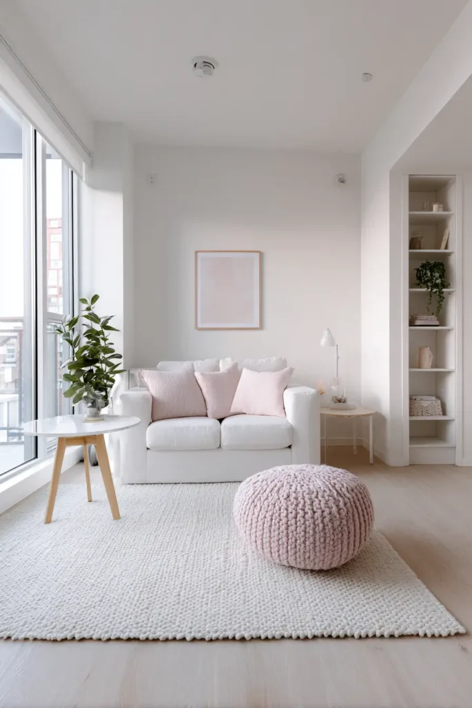
White is the safest choice if you want a fresh look. It makes pink feel light and simple. This works very well in small rooms because it reflects light and makes the space look bigger.
You will often see this in Scandinavian designs. IKEA uses blush pink with white walls and furniture to create calm spaces that feel open.
If you are unsure where to start, use white as your base and add pink in cushions, rugs, or one wall. This keeps things balanced
Grey Makes Pink Look Modern
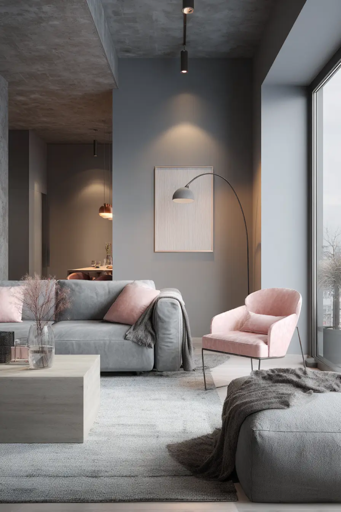
If pink feels too soft for you, grey can fix that. Grey tones down the brightness and adds a clean, modern feel.
This pairing is very popular right now. Houzz trend reports show that grey and pink are often used together in living rooms and bedrooms. It works because grey adds structure while pink adds warmth.
Use light grey for a soft look. Use dark grey if you want contrast. Both work well with blush pink
Feel Green Adds a Fresh Natural
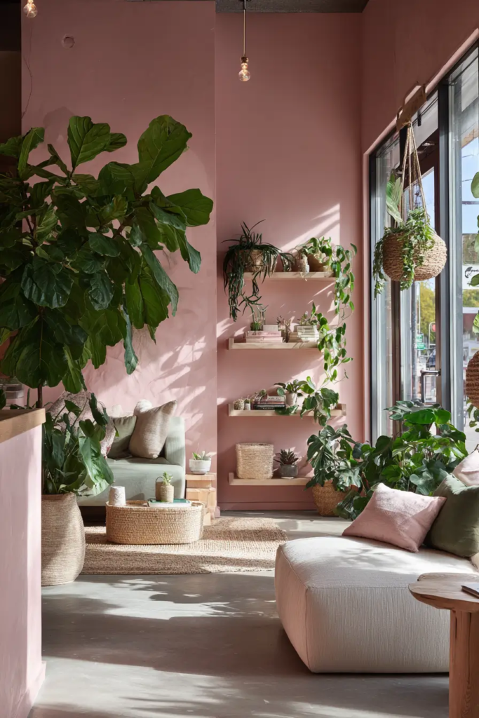
Pink and green sit opposite on the color wheel. That means they balance each other naturally. This is why the combo feels fresh and easy to look at.
You see this a lot in plant filled homes. Pinterest trends show a rise in biophilic design, where people mix soft pink walls with indoor plants and sage green tones.
Even a few green plants can change the whole room. If you want more impact, try sage green furniture or decor
Navy Blue Adds Depth
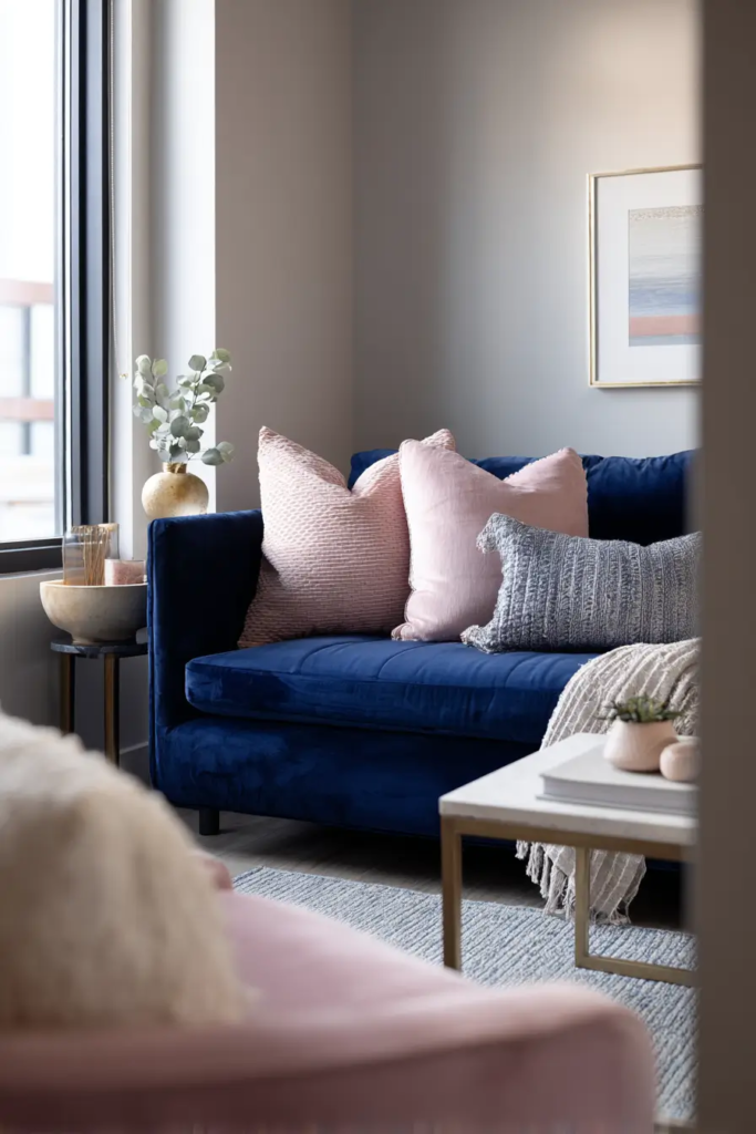
Navy blue gives pink a strong base. It stops the room from feeling too soft or flat.
This works best in bedrooms and living rooms. For example, blush pink cushions on a navy sofa create a balanced look that feels both calm and bold.
If your space feels too light, adding navy can fix that fas
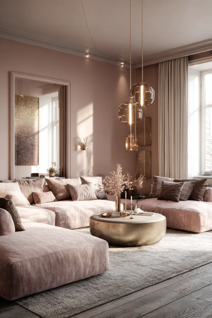
Gold Brings Warmth and Style
Gold works well with warm pink tones. It adds a soft shine that makes the space feel more polished.
You do not need much. Small touches like lamps, mirrors, or handles can make a big difference.
Designers often use this combo in modern interiors because it feels simple but still special.
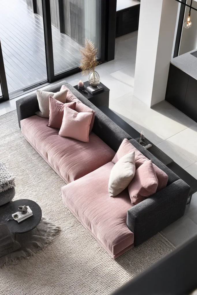
Black Creates Strong Contrast
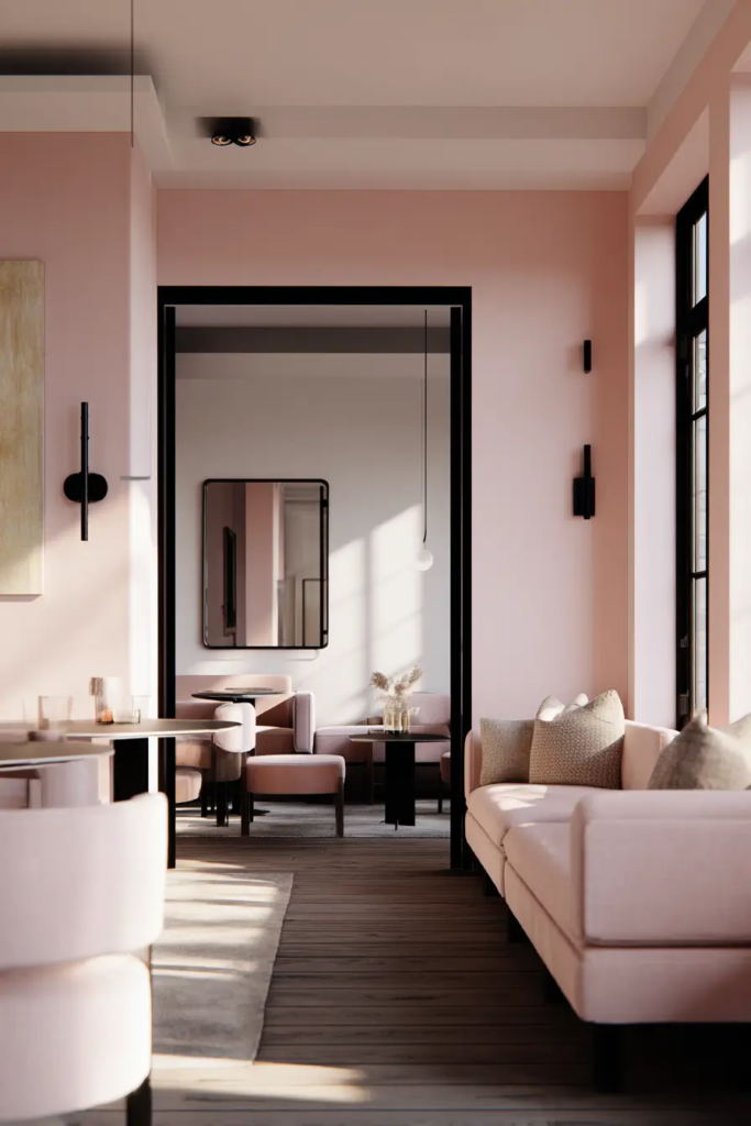
Black and pink create a bold look. Black gives structure, while pink softens it.
This works best in small amounts. Too much black can make the room feel heavy. Use it in frames, lighting, or furniture edges.
If your pink space feels too soft, adding black can give it balance
Beige Keeps Things Calm
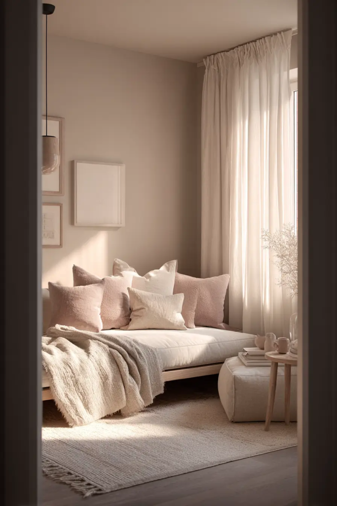
Beige is softer than grey. It blends with pink instead of contrasting with it.
This is a good choice if you want a calm and cozy space. Beige walls with pink decor create a warm and relaxed feel.
It works well in bedrooms and quiet living spaces
Mustard Yellow Adds Energy
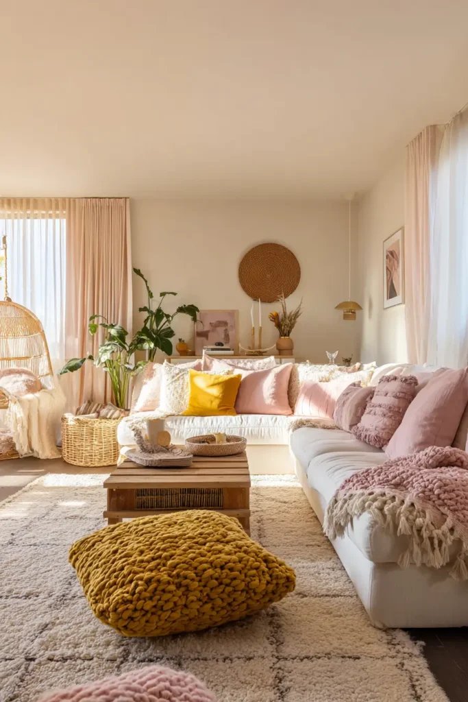
If your room feels dull, mustard yellow can bring it to life. It adds warmth and energy without being too bright.
This combo is common in boho style homes. You will often see pink cushions mixed with mustard throws or rugs.
Use it in small pieces if you want to test it first
Teal Creates a Bold Look
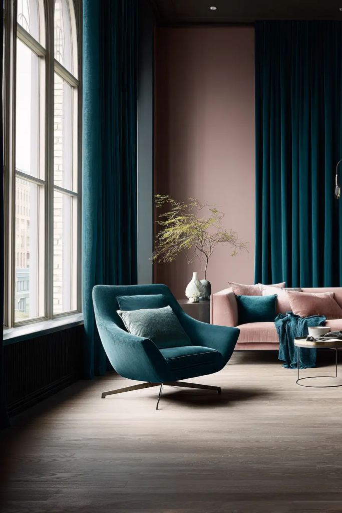
Teal is a strong color, so it stands out next to pink. This makes the room feel rich and full of character.
It works well for statement spaces. Think of a pink wall with teal chairs or curtains.
If you like bold designs, this is a great option
Brown Grounds the Space
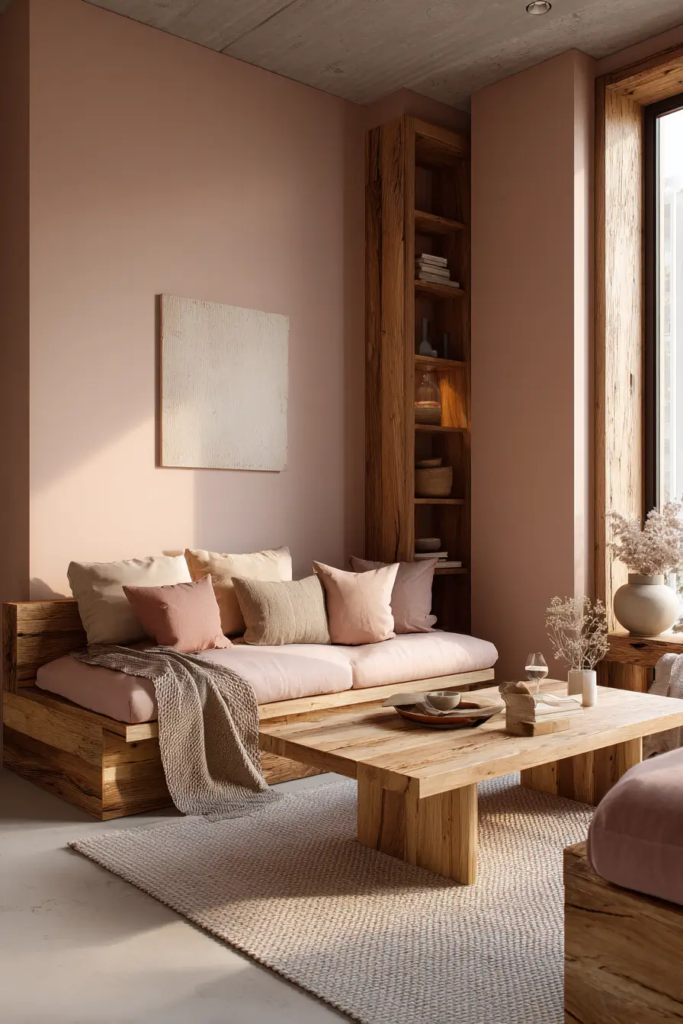
Brown adds a natural base to pink. It keeps the room from feeling too soft or light.
Wood furniture is an easy way to bring this in. Light wood works with soft pink. Dark wood works with deeper pink shades.
This combo feels warm and real, not forced
Lavender Creates a Soft Blend
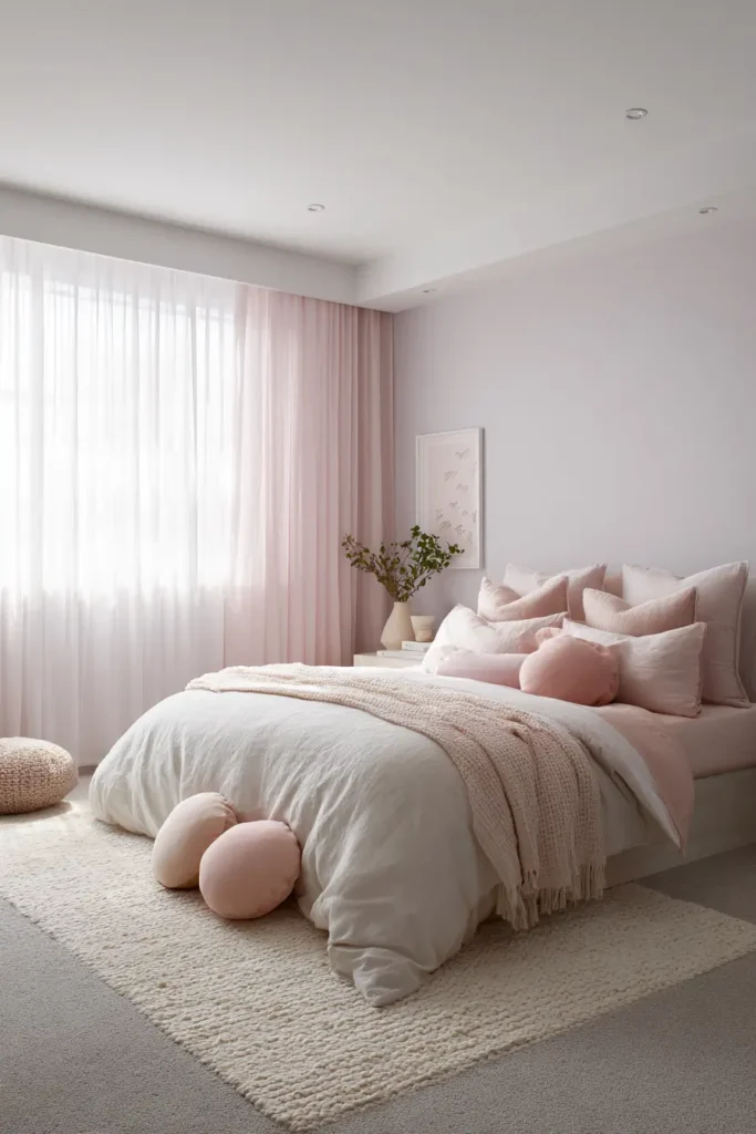
Lavender and pink sit close on the color wheel. This makes them easy to mix.
The result is soft and calming. This works best in bedrooms where you want a peaceful mood.
Keep the tones light so the room does not feel too busy.
Red Adds Depth
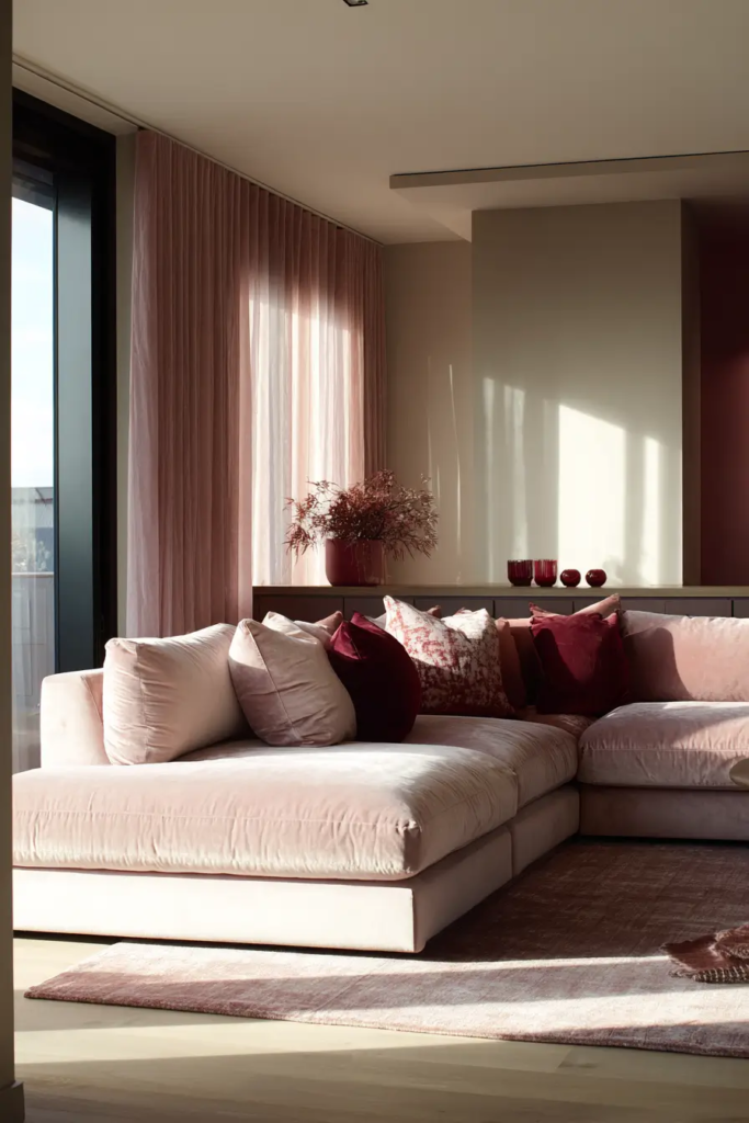
Red and pink can work together if done right. The key is balance.
Use red in small amounts. It adds depth and makes pink feel richer. Too much can feel overwhelming.
Think of red cushions on a pink sofa or small decor pieces.
Orange Feels Playful
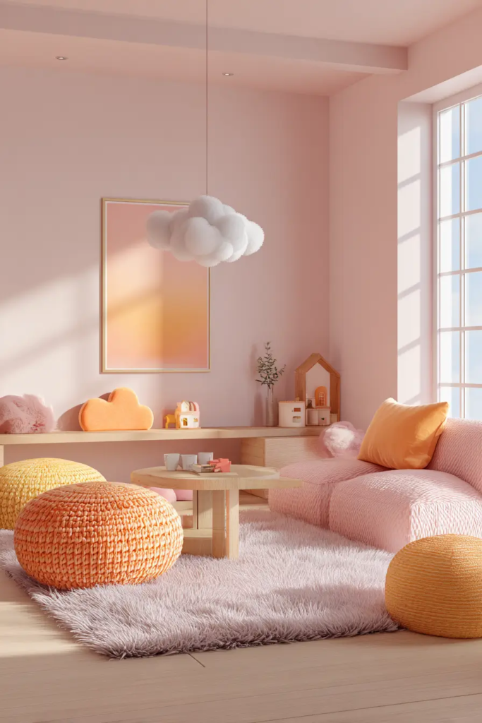
Orange and pink create a fun and lively space. This works best in creative areas like kids rooms or small corners.
Use soft orange tones if you want a more relaxed look. Bright orange will make the space feel more active.
Charcoal Adds a Modern Edge
Charcoal is darker than grey and adds strong contrast. It makes pink stand out more.
This works well in modern spaces. For example, a charcoal sofa with pink cushions looks clean and stylish.
Use it if you want a bold but controlled look.
Metallics Add Texture
Metallic tones like rose gold and copper add shine and texture. They work especially well with pink because they share warm tones.
Pinterest trend reports show a rise in metallic accents in home decor. These small details make spaces feel more complete.
Use them in lighting, frames, or decor pieces.
Conclusion
Pink is more flexible than most people think. It can feel calm, bold, modern, or cozy depending on what you pair it with.
The key is balance. Use the right tones, add contrast, and test your choices before making big changes.
Start small. Try new colors with cushions, rugs, or decor before painting walls. This helps you see what works without risk.
Now that you know the best colors that go with pink in home decor, you can create a space that feels right for you.