14 Colors That Go With Red Brick Homes
Why picking the right colors matters for red brick
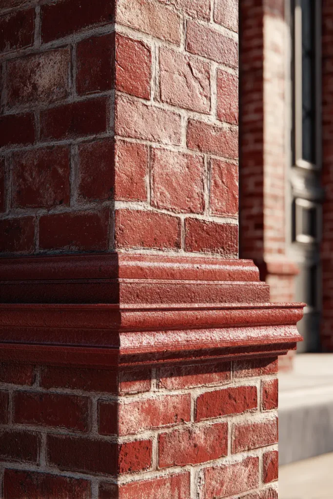
Red brick is strong on its own. It already has deep warm tones that pull attention. When you choose paint or decor without thinking, the whole house can feel off. It may look too dark, too orange, or too heavy on the eyes.
The goal is simple. You want balance. Red brick needs colors that calm it down or support its warmth. When this balance is right, the home feels more modern and more comfortable to live in.
Home design reports from platforms like Houzz and major paint brands such as Sherwin Williams and Benjamin Moore show a steady shift toward soft neutral and earthy palettes for brick homes. This is because people want homes that feel clean but still warm.
Light colors can open up space around brick. Dark colors can add contrast and drama. Both can work, but only when used with care.
If the wrong color is used, even a well built home can look outdated. But when the right pairing is used, red brick becomes a strong design feature instead of a problem.
Best neutral colors that go with red brick
Neutral colors are the safest starting point with red brick. They do not fight the brick. Instead, they support it.
White is one of the most used options. A soft white or warm white helps brick stand out without looking harsh. Many designers use shades like warm white tones on trim, walls, and ceilings because they keep things simple and clean.
Cream and ivory also work very well. These colors soften the strong red tones in brick. They create a gentle look that feels natural and calm.
Greige is another strong choice. It sits between gray and beige. This makes it flexible for both warm and cool brick shades. It is often used in modern homes because it feels balanced and fresh.
Soft taupe and warm beige also blend nicely with brick. These shades are often used in living rooms and hallways where you want a quiet background that does not compete with furniture or brick walls.
Designers often prefer neutral palettes because they also help with resale value. Buyers find it easier to connect with homes that do not feel too bold or risky in color choice.
When used correctly, neutral colors make red brick look intentional, not accidental. The brick becomes the highlight instead of a problem area.
Cool colors that balance red brick
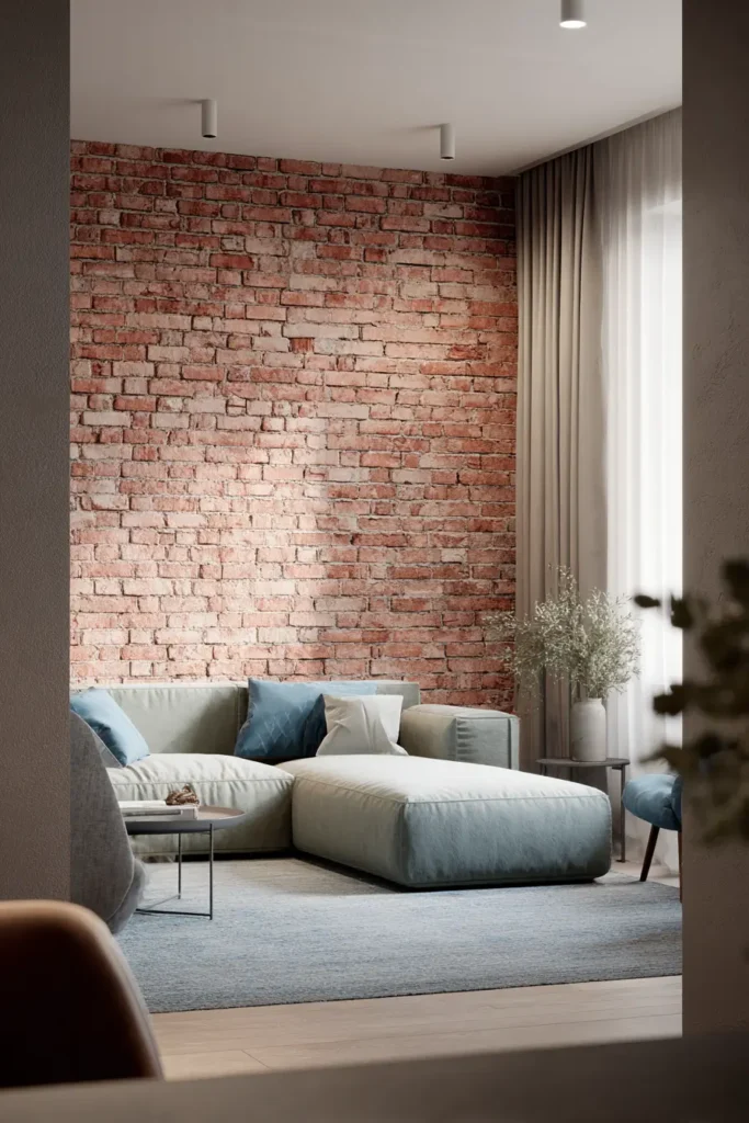
Cool colors are useful when red brick feels too warm or heavy. They bring contrast and help calm the strong red tones.
Sage green is one of the most popular choices right now. It appears often in modern home ideas shared on Pinterest and design platforms. It works because it is soft and natural. It does not overpower the brick.
Soft blue and dusty blue also pair well with brick. These shades add a light and airy feeling. They are often used in bedrooms and bathrooms where you want a relaxed mood.
Muted teal brings a slightly richer look. It still stays calm but adds more depth. It works well in kitchens or accent walls.
Charcoal gray is a stronger option. It creates a bold contrast against red brick. This is often used in modern homes where a dramatic look is desired.
Navy blue is another strong pairing. It is often used on exterior doors or shutters. It gives brick homes a classic and clean finish.
Cool tones work best when you want red brick to feel less heavy and more balanced. They also help bring a modern look without removing the character of the brick.
Earthy colors that enhance red brick warmth
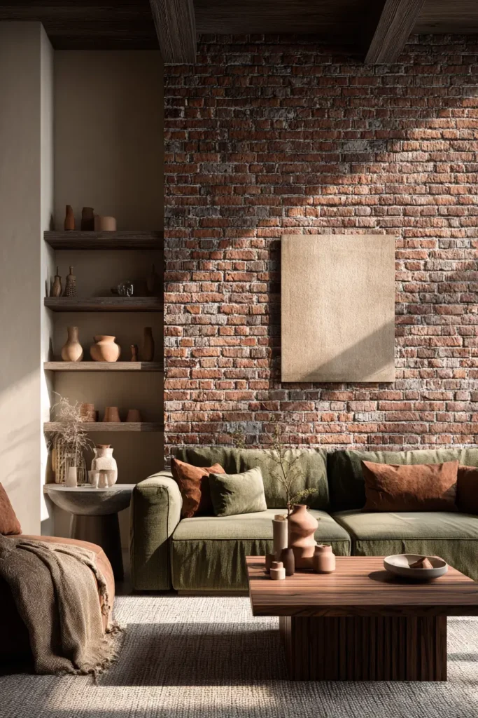
Earthy colors work naturally with red brick because they share similar warmth. This creates a smooth and connected look.
Olive green is a strong choice. It blends with the natural tones in brick and feels calm. It is often used in homes that aim for a natural or garden inspired style.
Terracotta shades also work well. They are close to brick but softer in intensity. This creates a layered warm look that feels cozy.
Warm brown and mocha tones add depth. They are often used in furniture or accent walls to support brick without clashing.
Sand and desert inspired beige shades help soften the strong red color. They are often used in open living areas to keep things bright but grounded.
Clay inspired neutrals are also growing in popularity. They bring a natural handmade feel that works well with exposed brick walls.
These earthy tones are best when you want the home to feel warm, grounded, and connected to natural materials.
Bold accent colors that work with red brick
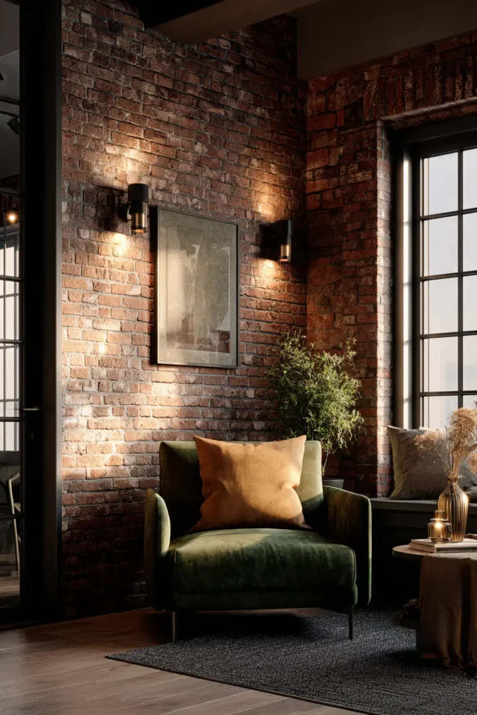
Bold colors can work with red brick, but they must be used carefully. They are best for accents, not full walls.
Black is one of the strongest options. It creates a modern and sharp contrast. It is often used in window frames, doors, and metal fixtures.
Deep forest green also pairs well with brick. It feels rich and natural at the same time. It works well in exterior doors or statement furniture pieces.
Burgundy or wine tones are close to brick but slightly deeper. This creates a layered red effect that feels rich and warm.
Mustard yellow can add a bright accent. It works best in small amounts like decor pieces or outdoor seating.
Copper and bronze finishes are also important. They are not paint colors, but they enhance red brick by adding shine and warmth in lighting and hardware.
Bold colors are not meant to dominate. They are meant to highlight and support the brick without taking over the space.
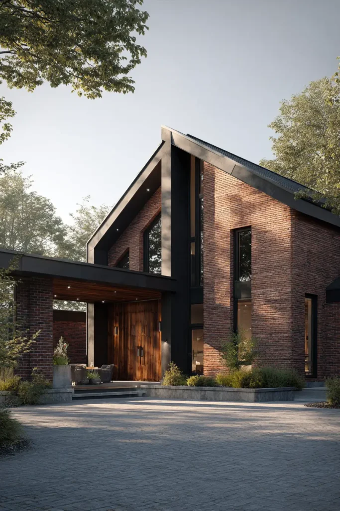
Exterior color combinations for red brick homes in 2026
Exterior design trends are moving toward simple and clean combinations. Red brick homes are often updated instead of fully changed.
White trim with black accents is one of the most common combinations. The white keeps things fresh while black adds structure and contrast.
Sage siding paired with red brick is also popular. It creates a soft natural look that feels modern but not cold.
Navy doors with brick exteriors give a strong and classic appearance. This is often seen in traditional and updated homes.
Greige siding works well when homeowners want a soft and neutral base. It helps blend brick into a more modern exterior style.
Some homes also use full neutral palettes with soft white, gray, and beige tones. These combinations keep brick as the main feature while updating everything around it.
Recent home value studies show that neutral and balanced exterior colors often attract more buyer interest. This is because they feel easier to personalize.
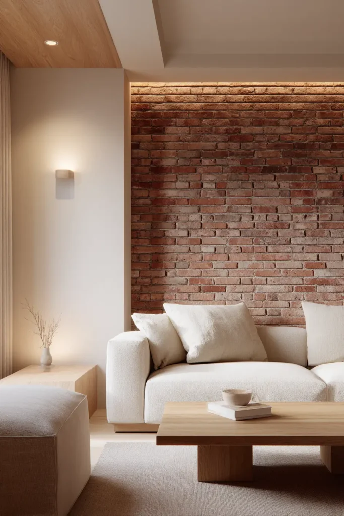
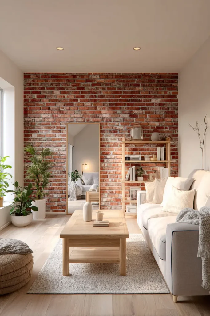
Interior color ideas with red brick walls
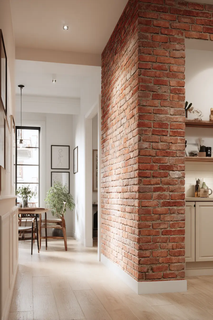
Inside the home, red brick walls often become the main feature. The colors around them must support that.
Soft white walls are often used to brighten spaces with brick. This works well in living rooms where natural light is limited.
Light gray also works in modern interiors. It keeps the space calm and does not compete with the brick texture.
In kitchens, white or cream cabinets are often paired with brick backsplashes. This creates a clean but warm cooking space.
Wood tones also pair well with brick. They add natural balance and work especially well in rustic or modern rustic homes.
In loft style spaces, designers often mix brick with black metal frames and neutral furniture. This creates an industrial look that feels strong but simple.
The key in interiors is not to compete with the brick. Instead, the goal is to let it stand out while everything else stays supportive and simple.
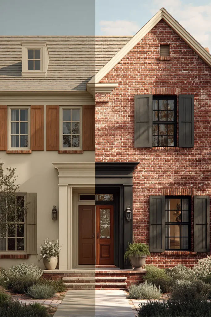
How natural light changes red brick color choices
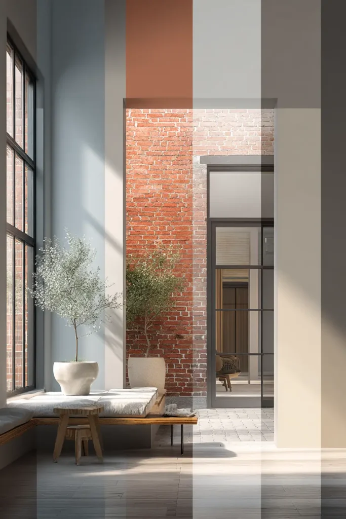
Natural light changes how red brick looks more than most people expect. The same brick can look deep red in shade and much brighter in sunlight. This is why a paint color that looks good inside a store can look completely different on your home. North facing homes usually get cooler light, so brick can look darker and slightly dull. In that case, lighter neutrals and warm whites help balance it. South facing homes get stronger sunlight, which makes brick look warmer and more orange. Here, cooler shades like soft gray or sage green help calm it down. Morning and evening light also shift how brick appears during the day. This is why you should never choose paint based on one lighting condition. You need to see how the brick changes from morning to night before deciding any final color.
Best front door colors for red brick homes
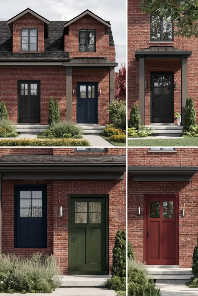
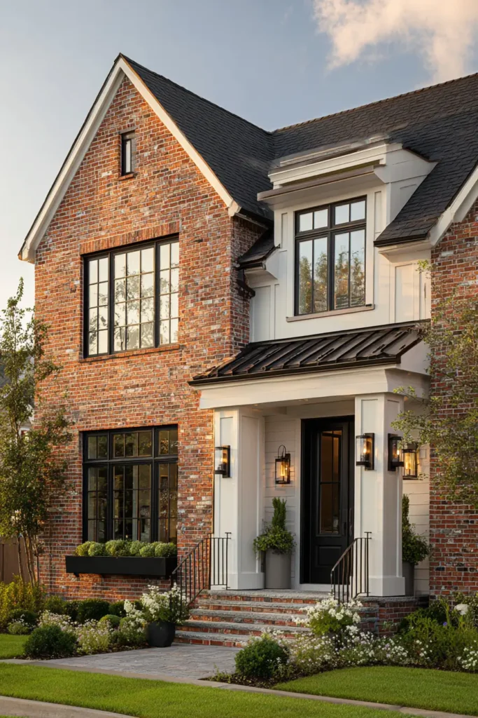
The front door is one of the most important color choices for a red brick home. It is the first thing people notice. Black is a strong and safe choice because it creates clean contrast and feels modern. Deep green also works well because it blends with natural surroundings while still standing out. Navy blue is another popular option that gives a classic and calm look. If you want something warmer, a deep burgundy can connect nicely with the brick without feeling too bright. Even soft wood finishes can work when you want a natural feel. The key is to avoid overly bright colors that clash with the brick tone. A front door should highlight the home, not pull attention away from the overall structure.
How roof color affects red brick appearance
Roof color has a strong impact on how red brick looks, even though people often ignore it. A dark roof, like charcoal or black, makes red brick look more modern and sharp. It also helps ground the house visually. Lighter roofs, like soft gray or brown, can make the home feel warmer but sometimes less defined. If the roof color clashes with the brick, the entire house can feel unbalanced. For example, a very red or orange roof next to red brick can feel overwhelming. The goal is to create calm contrast. Roof color should support both the brick and the trim, not fight them. When all three elements work together, the house looks more complete and well planned.
Using landscaping colors with red brick houses
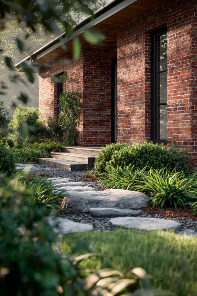
Landscaping plays a bigger role in color balance than many people realize. Plants, soil, and outdoor materials all sit next to red brick and affect how it looks. Green plants are the most natural partner because they balance the warm red tones. Dark green shrubs create depth, while lighter plants soften the look. Stone paths in gray or beige also help reduce visual heaviness around the home. Mulch color matters too. Dark mulch can make brick feel richer, while lighter mulch creates a softer appearance. Flowers can add small color accents, but they should not overpower the brick. The goal of landscaping is to frame the house, not compete with it. When done well, it makes the red brick feel more natural and grounded.
Interior lighting that improves brick walls
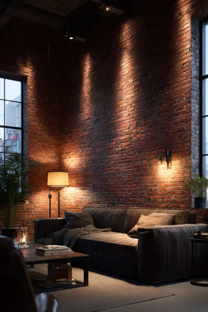
Lighting changes how red brick feels inside a home. Warm lighting makes brick look softer and more inviting. Cool lighting can make it feel sharper and sometimes too harsh. The placement of lights also matters. Wall lights that shine across the brick surface highlight texture and depth. Overhead lighting can flatten the look if it is too strong. Natural light from windows helps brick look its best during the day, while soft lamps improve the mood at night. Many modern homes use layered lighting to avoid flat spaces. This means combining ceiling lights, floor lamps, and accent lighting. When lighting is balanced, red brick becomes a design feature instead of just a wall.
Modern style vs traditional style with red brick
Red brick works in both modern and traditional homes, but the color choices are different. Traditional styles usually use warmer tones like cream, beige, and wood finishes. These colors keep the home feeling classic and cozy. Modern styles use stronger contrast. Black, white, and cool gray are common because they create clean lines and sharp structure. Sage green and muted blue are also used in modern designs for a softer but updated look. The biggest difference is contrast level. Traditional design keeps everything closer in tone. Modern design creates clear separation between brick and surrounding colors. Neither style is better. It depends on how you want the home to feel and how bold you want the brick to appear.
Choosing paint finish for brick surfaces and trims
Paint finish changes how colors look next to red brick. A flat finish absorbs light and gives a soft look, but it can be harder to clean. Satin finish is often used because it reflects a small amount of light and is easier to maintain. Semi gloss is common for trims and doors because it makes edges stand out clearly. Using the same finish everywhere can make the home feel flat, so variation is important. Brick itself is usually not painted, but surrounding surfaces like trim and siding need careful finish selection. The right finish helps highlight texture and keeps colors looking stable in different lighting conditions.
How small spaces should handle red brick walls
Small spaces with red brick walls need careful color control. Dark colors can make the room feel smaller than it is. Light colors help open the space and reduce heaviness. Soft whites, light grays, and warm creams are often the safest choices. Too many strong colors in a small room can create visual stress. Furniture also matters. Light wood and simple shapes work better than heavy dark pieces. Mirrors can help reflect light and balance the brick surface. The main goal in small spaces is not to hide the brick, but to keep it from overwhelming the room. Simple color choices make the brick feel intentional instead of too strong.
Testing paint colors before final decision
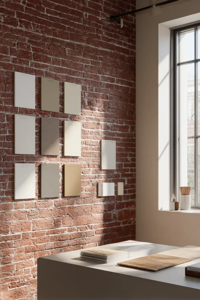
Testing paint colors is one of the most important steps, but many people skip it. A color can look perfect on a sample card but completely different on a real wall. Always test paint on a small section of the wall next to the brick. Look at it in morning light, afternoon light, and evening light. This helps you see how the color reacts in real conditions. It is also helpful to place samples next to furniture and flooring. These elements all affect the final look. Do not rush this step. A small test can prevent costly mistakes later. Taking time to compare shades will give you a much better result.
Conclusion
Red brick gives a strong base, but the wrong colors can make it feel heavy or outdated. The right choices bring balance and make the home feel more open and modern. Neutrals keep things simple. Cool tones add contrast. Earthy shades create warmth. Bold accents add character when used in small amounts. Every detail matters, from lighting to roof color to landscaping. When all parts work together, red brick becomes a design strength instead of a challenge. Take time to test colors in real light and trust what you see over time.